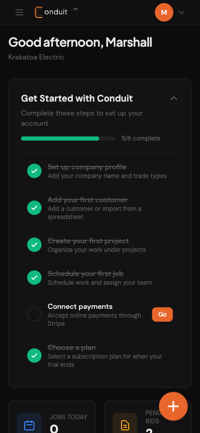
When you log into Conduit, you land on your dashboard. It’s home base. Stat cards at the top, today’s schedule and action items in the middle, the top nav across the very top of every page. This guide walks each part of it.
Each tab below covers a section of the dashboard. Click Get started to begin, or jump straight to the tab that matters to you.
01The four stat cards
Across the top of the dashboard you have four cards. They are clickable shortcuts to the part of Conduit that matters for that number. No deep navigation required.
- Jobs Today. Click to jump to the calendar for today.
- Pending Bids. Click to see your open bid pipeline.
- Revenue This Month. Click to land on the analytics page.
- Outstanding. Click to see what is unpaid (your collections list).

- 1. Jobs Today
- 2. Pending Bids
- 3. Revenue This Month
- 4. Outstanding
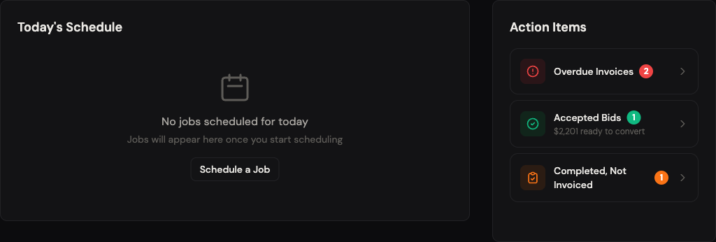
02Today’s Schedule and Action Items
The middle of the dashboard is where the work lives. The left card is your day. The right panel is your to-do list.
Today’s Schedule
Every job scheduled for today shows up here with the time, the customer, and the current status. Click any row to open the full job detail. If nothing is on the books, the card shows a friendly empty state with a Schedule a Job link.
Action Items
The right panel is Conduit telling you what needs attention. Each row links straight to the relevant filtered list.
- Today’s Schedule. Your day at a glance. Click a row for the full job.
- Action Items. Conduit’s to-do list for the office.
- Overdue Invoices. Sorted by how late they are. Click to send reminders.
- Accepted Bids. Bids the customer accepted. Convert them to jobs or invoices.
- Completed, Not Invoiced. Work done, money not yet billed. Bill it.
- 1. Today's Schedule
- 2. Action Items
- 3. Overdue Invoices
- 4. Accepted Bids
- 5. Completed, Not Invoiced
You can also see Unsent Invoices and Unassigned Jobs sections in the Action Items panel when you have any. Each one shows a count and a dollar amount, and the action sits one click away.
03The top navigation
Across the top of every page, the navigation is organized by what you do day to day. Three groups, separated by thin dividers.
- Primary group: Customers, Projects, Jobs, Invoices, Calendar, Recurring. The records you create and edit constantly.
- Operations group: Timesheet, Messages, Pricebook, Vendors. The workflow tools your team uses while jobs are in flight.
- Analytics group: Analytics (revenue, P&L, AR aging) and Payments (Stripe Connect status). The numbers and the money plumbing.
A single bookmarkable URL per page. No nested menus on desktop. On mobile the same items live behind a hamburger button.
- 1. Primary group
- 2. Operations group
- 3. Analytics group
Try clicking Customers to land on your customer list, then click the Conduit logo in the top-left to come right back to the dashboard.
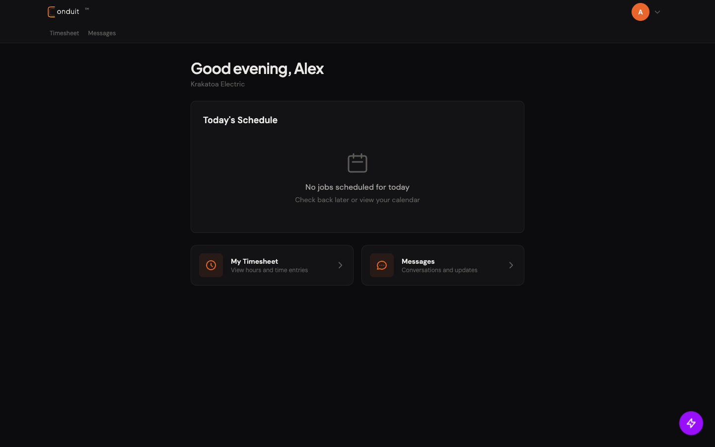
04The technician view
If you log in as a technician, the dashboard looks different. It is built for the field, not the office.
You see your schedule for the day. If you are clocked into a job, a banner at the top shows which job and how long you have been on it. Below that, two quick-link cards: your timesheet and your messages.
The nav is simplified too. Technicians see only Timesheet and Messages. No invoices, no analytics, no pricebook. Only the tools needed on the job.
- Greeting. Same first-name greeting, same company name underneath.
- Today’s Schedule. Today’s assigned jobs only.
- My Timesheet. One-tap to your hours and time entries.
- Messages. Conversations with the office and customers.
- Simplified nav. Two items vs the owner’s twelve.
- 1. Greeting
- 2. Today's Schedule
- 3. My Timesheet
- 4. Messages
- 5. Simplified nav
This split is enforced server-side. Technicians cannot reach owner-only pages even if they type the URL by hand. The frontend hides; the backend enforces.
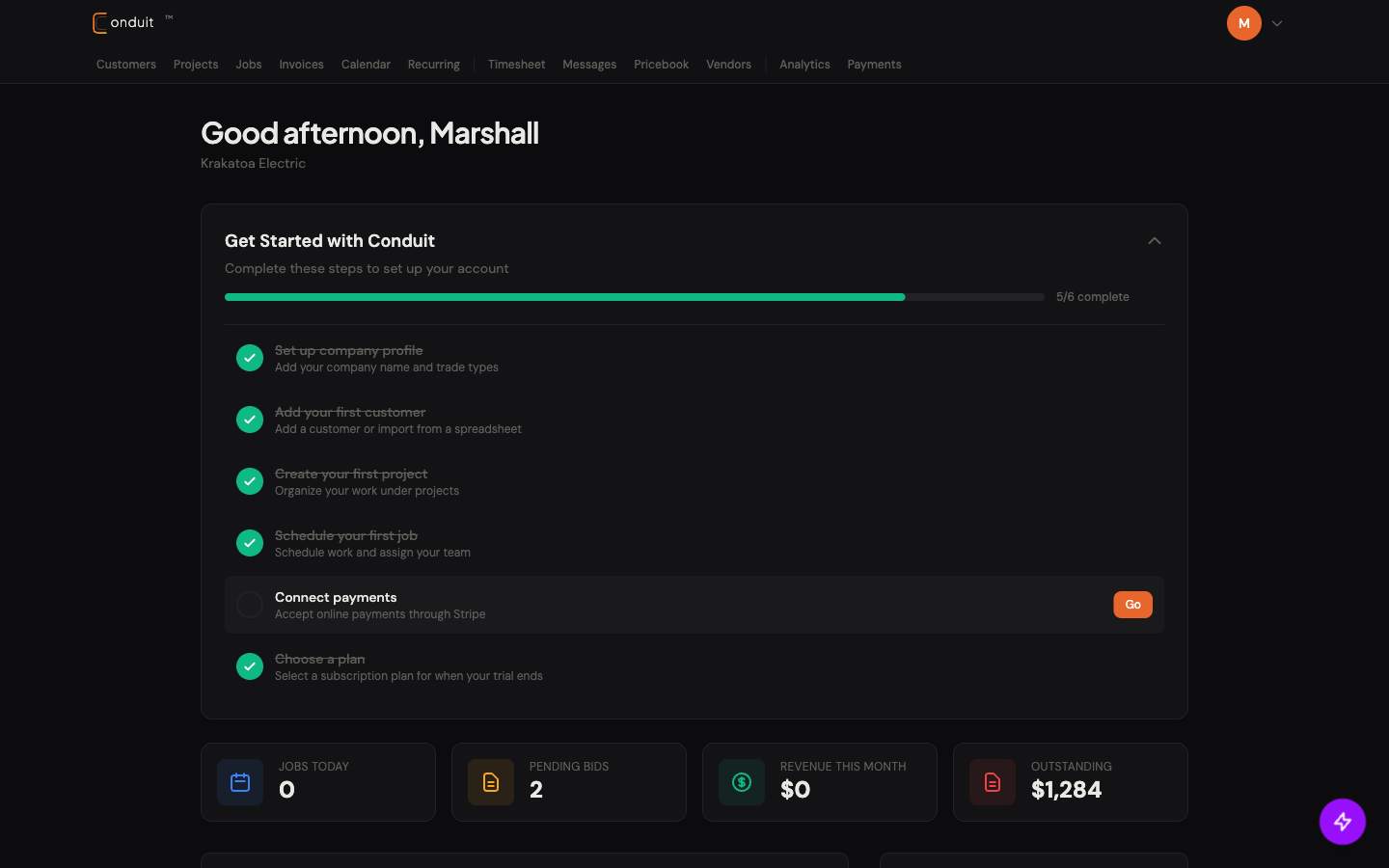
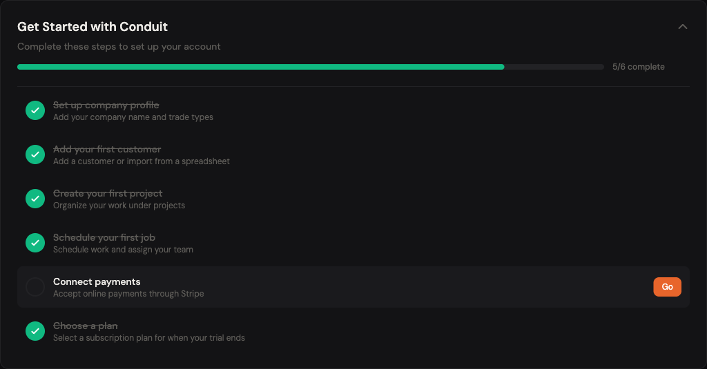
05The onboarding checklist (new accounts)
Brand new accounts see a Get Started with Conduit card at the top of the dashboard. Five or six steps, a green progress bar, each linking straight to the relevant setup page.
- Set up company profile. Goes to Settings → Company.
- Add your first customer. Goes to Customers.
- Create your first project. Goes to Projects.
- Schedule your first job. Goes to the Calendar.
- Connect payments. Stripe Connect setup.
- Choose a plan. Subscription tier picker for when your trial ends.
- 1. Collapse / expand
- 2. Per-step status
- 3. One-click Go button
The checklist auto-hides once everything is complete. You can also collapse it any time with the carat at the top right.
06Mobile
On a phone, the desktop nav becomes a hamburger button at the top-left. The dashboard stacks: greeting on top, onboarding (if applicable), then stat cards, then schedule, then action items. A floating + button at the bottom-right is the primary “create something” shortcut and changes based on context.
- Hamburger. Opens the same nav as desktop.
- Floating + button. Quick-create. Default action: create a job.
- 1. Hamburger
- 2. Floating +
The mobile experience is the same content, just stacked. Field techs can also install the iOS or Android app for push notifications and a faster cold-start (the web view works without the app, but the native app is sharper for daily field use).